Images and media
For people editing this documentation site — how to add screenshots, diagrams and social images to docs and blog pages.
This page isn't about using Enscale
It's an internal guide for whoever writes and edits this documentation site — how to add screenshots to a docs page.
If you're a store owner looking for help with Enscale, nothing here applies to you. Try Getting started or Troubleshooting instead.
Use images to explain setup flows, dashboards, workflow templates, inbox behavior, and storefront widgets.
Where images live
Save public images in the public/images folder, one subfolder per docs section.
public/images/
  docs/
    inbox/inbox-layout.png
    channels/whatsapp-connect.png
    automation/flow-builder.png
  blog/
    unified-inbox.png
  og/
    default-og.png
Files in public are served from the site root.
For example:
public/images/docs/inbox/inbox-layout.pngis available at:
/images/docs/inbox/inbox-layout.pngWrite the slot before you have the screenshot
Add the DocImage to the page as soon as you know a screenshot belongs there,
even if nobody has captured it yet. A slot with no file behind it fails safely:
| Where | What a reader sees |
|---|---|
pnpm dev | A dashed "screenshot pending" box carrying the path and the alt text. |
| Production | Nothing at all. No broken image, no empty frame. |
This keeps the page honest about what it needs without shipping a placeholder to
a merchant. To see the placeholders on a staging deploy, build with
NEXT_PUBLIC_SHOW_SCREENSHOT_PLACEHOLDERS=1.
Finding what's outstanding
pnpm validate:docsIt lists every slot with no image behind it, along with the page it's on and the
alt text describing the shot — that's the capture brief. It also flags images in
public/images/docs that no page references, and fails the build if a slot is
missing its src or alt.
DocImage
The default for a screenshot. Renders framed, captioned, and lazy-loaded.
<DocImage
  src="/images/docs/inbox/inbox-layout.png"
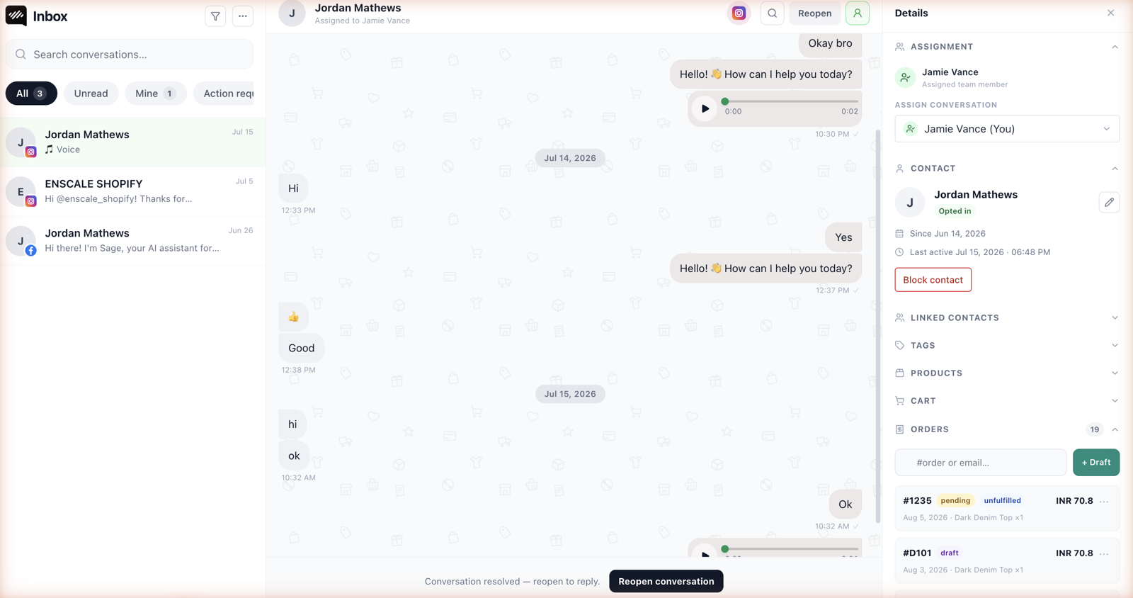
  alt="The inbox in three panels: the conversation list, the message thread, and the contact sidebar showing Shopify order history"
  caption="The three panels, left to right. On narrow screens they collapse to one at a time."
/>| Prop | |
|---|---|
src | Root-relative path under /images/. Required. |
alt | What the screenshot shows. Required. |
caption | Optional. Adds something the surrounding prose doesn't already say. |
priority | Loads eagerly. Set it on the first screenshot of a page, at most. |
narrow | Constrains to phone width. Use for portrait screenshots. |
alt and caption are different jobs
alt is read by screen readers and shown when an image fails — describe the
content of the shot, not that it is a shot. Skip "screenshot of".
caption is read by everyone. A caption that restates the paragraph above it is
wasted; use it for what the picture shows but the prose didn't say.
Portrait screenshots
A phone screenshot stretched across the prose column is unreadable. Use narrow:
<DocImage
  src="/images/docs/inbox/mobile-conversation.png"
  alt="The team inbox on a phone, showing one conversation with the composer at the bottom"
  caption="On a phone the three panels become one at a time."
  narrow
/>
ImageGrid
Two screenshots side by side, for comparing screens or showing both halves of one idea — a setting and its effect, an admin view and a storefront view.
<ImageGrid>
  <ImageCard
    src="/images/docs/channels/webchat-widget-settings.png"
    alt="The widget settings panel with accent colour, position and page visibility controls"
    title="Widget settings"
    description="Accent colour, position, and which pages show the bubble."
  />
  <ImageCard
    src="/images/docs/channels/webchat-storefront.png"
    alt="A storefront product page with the chat bubble in the bottom corner"
    title="On the storefront"
    description="What a shopper sees once the embed is enabled."
  />
</ImageGrid>
ImageCard crops to 16:9, so don't use it for anything portrait.
Diagrams instead of screenshots
A screenshot shows what a screen looks like. It's the wrong tool for showing how
something works over time — the service window, a conversation's states, what
happens as usage passes a limit. Those are diagrams, and the docs ship them as
inline SVG components in components/mdx-diagram.tsx, themed to light and dark
automatically. Reach for one of those, or add a new one, rather than screenshotting
a whiteboard.
Basic Markdown image
For a simple inline image with no frame or caption:
This gets no placeholder handling — a missing file is a broken image. Prefer
DocImage for anything that isn't captured yet.
Blog images
Blog pages are written in TSX today. Use a regular image tag inside blog content.
<img
  src="/images/blog/whatsapp-automation.png"
  alt="WhatsApp automation flow for Shopify"
/>
Open Graph images
Use 1200x630 images for social sharing.
Recommended folder:
public/images/og/The app already has a generated default Open Graph image. Add custom static OG images later when the brand visuals are ready.
Capture guidelines
- 1600x900 for wide screenshots — shot at 2x on a retina display, since they render up to 720px wide. 1200x630 for social images.
- Light mode. The frame around a screenshot is theme-aware; the screenshot isn't, and a dark shot on a light page reads as a mistake.
- Crop to the point being made. A full-screen capture where nothing is legible helps nobody. The alt text says what the shot needs to show.
- Drop browser and OS chrome, unless the URL is the point — it is, for the Shopify admin install screens.
- Keep files under 300 KB.
.pngfor UI,.webpif it saves meaningfully.
Never publish real customer data
Docs are public. Shoot from a demo store with fabricated data, or redact:
- Customer names, phone numbers, email addresses, and message contents
- Staff names and email addresses
- Access tokens, API keys, session IDs, webhook secrets
- Live shop domains, unless that merchant agreed to appear in the docs
- Order numbers and totals tied to a real order
Blur rather than black-box, so the shape of the UI stays readable.
This is the same obligation described in Security and privacy — a screenshot is a disclosure like any other.
Next steps
- Read Dedicated inbox web.
- Read Flow templates.
- Read Security and privacy.